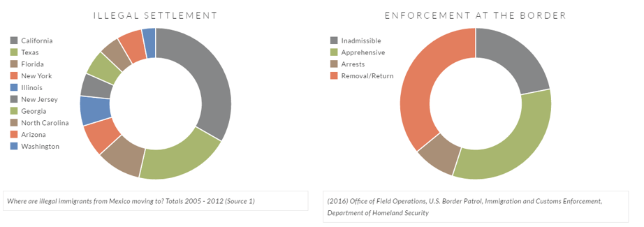
I have been working on a project called "Data Wall" that acts as a digital border of statistics for immigration in the United States. The project scope focuses on immigration from Mexico (legal, illegal, and legal permanent residence) for now. I have collected over 15,000 documents from Department of Homeland Security from the 90's to present day about immigration. These documents look at age, sex, location, employment, where they move to, arrests, and a ton of very specific data. With all of this data, we're able to find patterns and information about immigration that may have never been thought about before.
This project is about apolitical big data and trends of legal and illegal immigration to each state in the United States. I am focusing on the overview of data as well as 10 specific states: Arizona, California, Florida, Georgia, Illinois, New Jersey, New York, North Carolina, Texas, and Washington. I don't want to give too much information at this point, but I may be joined by a friend that is an excellent programmer to help me create an interactive map that displays all of this in a timeline.

The 10 states I've mentioned above have their own pages with detailed information about their distinct features. We can look at immigration into each state specifically. I am focusing on 2005 - 2012 and the census. We can look at both the number of people and the percentage of all immigration in the U.S. versus that state. Building the charts, we already found some pretty cool information. For example, Arizona's charts look pretty similar, and the similarities and differences between the number and the percentage can tell us years that there was more immigration, but less people moving to Arizona or less immigration but more people moving to Arizona.

We also found (but have yet to verify) that traditional Republican states saw a reduction in immigration during and after the census while traditional Democratic states saw a rise in immigration during and after the census. We are hoping to find out more events like this. We're hoping to organize month-by-month data in northern and southern states to see if climate or time of year affects immigration. With the mass amount of data I have, I can find out a lot about immigration since the 90's. I am hoping that next semester I can create a team to help organize, display, and create an interactive map as well as an informative website. I've always loved to work with data, and my HCI-side of me wants to create something that beautifully displays all of this data. I cannot wait to show this off in a couple of months!


Comment