Don’t you just love it when something looks pretty? When there is a cool image that just pops out and catches your eye? So do most gamers. In fact, with the latest advancements in the game industry, aesthetics have been a major focal point when attracting new audiences. No doubt that this strategy of showing off pretty aesthetics at conferences is an excellent form of promotion for the game, so long as they show those aesthetics in action. In this discussion, I’m going to go over what aesthetics offer the overall game and how important aesthetics are as a whole.

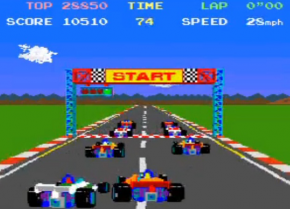
Aesthetics in gaming have advanced far, essentially traveled light years in terms of progress. For example, take a look at the images above and below. Both are racing games, the top being Pole Position (1982) and the bottom being Forza Horizon 3 (2016). These are just games in the racing genre, but it is evident that the visuals are immensely different. Mind you, these specific examples are only a bit over 30 years apart, which is not even a full lifetime.

First to note, is that aesthetics grab the audience’s attention. Immediately, Pole Position probably caught your eye just because of all the bright colors that were present. As for Forza Horizon 3, which is definitely dimmer in tone, it catches your eye because of how realistic it looks. One could easily mistake this screenshot from Forza as a picture in real life. And that’s where we transition into my second point on aesthetics: the style is dependent on the game itself.
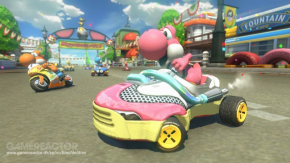
What I mean by this is that certain games call for a different style of aesthetic. For the most part, numerous titles have been focusing on more realistic aesthetics, using textures that portray a world that players can easily be immersed in. For example, Forza does call for realism, simply because the game is meant to simulate realistic racing. Certain titles do not call for realism, but Mario Kart is an example of how style matters.

Unlike Forza, Mario Kart is focused more on a colorful palette and wacky designs versus realism. This is because the characters in the Mario universe are not at all realistic. You’ve got Italian brothers who are plumbers, princesses who essentially belong in medieval times, colorful raptors, mushroom people, and whole bunch of other random things that just so happen to know how to drive cars. Thanks to Nintendo focusing more on style, the game stands on its own as an attractive series that is playable by pretty much all ages.
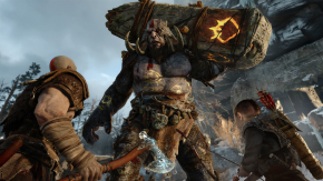
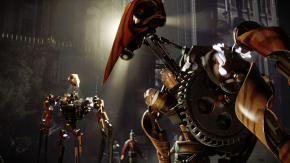
Aside from the racing genre, different genres may call for specific art styles. Take for example the Action-Adventure genre. These games tell a linear story that keeps the player invested by throwing different aspects their way. In a sense, these games are highly interactable movies, keeping the player immersed in various ways. Because of this, the aesthetics of most Action-Adventure games find a balance between realism and style. Take these examples:


The first image displays a screenshot of God of War, the newest installment coming to PS4 in 2018. Whether it’s based of this image or the gameplay trailer, it is easy to see that the aesthetics are highly realistic, giving the vibe that these myths are more real than we think. It presents the mythological creatures and figures of Greek (and now Norse) mythology in a way that is just awesome. If anything, Santa Monica aimed for this specific aesthetic so that the player will feel more immersed in this world of myth. In addition, it adds to the gore factor that God of War is notorious for, making it all the more fleshed out.
However, the second image displays things from Dishonored 2. For those who have played the game, you would know that the world in Dishonored is highly stylized and highly detailed. This makes some of the components in the environment and machinery look more realistic, but the characters clearly show that specific rough style that the artists utilize to show the hostility that is present throughout the entire game.
Of course, the whole topic of aesthetics could last for weeks, but I’m going to put a close on it (for now). Whether you prefer realistic aesthetics or even something colorful and wacky, know that the artists chose this style for specific reasons. But nonetheless, it pays off for a game to be pretty.


Comment