(1)
Over the past few years, the Google Design team has built out a beautiful living resource that explains what their design is, what it means, and what rules they follow. The term “Google Design” is an umbrella resource for Material Design, Google Fonts, Android Wear, Cardboard, Firebase, Angular Material, Polymer Paper Elements, Android Auto, and Android TV. While everything listed has its own unique identity, even they are not completely separate from each other. It is easy to see they were all built within the same design principles to create brand recognition and cohesion for user experience.
The “look” and rules of their design come from Material Design. The term Material refers to the physical world where surfaces can be layered on each other and there is depth in these systems. Material’s fundamentals are light, surface, and movement. Therefore, this design does not break any laws of physics when layers move or produce shadows. This layout affords the user’s understanding of the real world so that there is less time learning how to navigate the design and more time using the system to complete tasks.
Understanding the Evolution of Android Logos and OS Design
![]() (2)
(2)
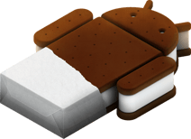
Android 4 - Ice Cream Sandwich
 (3)(4)(5)
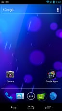
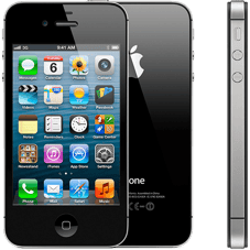
Google Design does not solely focus on Android, but it is a good example of their evolution in the design process. Android 4 used varying 3D shapes and focused heavily in “roundness” and depth to their icons, UI, and menus. This version of Android was released in 2011 before the iPhone 4s was released in October of the same year. Apple had a very similar design with bubbly icons, reflective surfaces, and gradient colors. This was just the in season design at the time. Users were falling in love with the big, bright touch screens and mobile graphics were getting strong enough to handle more advanced graphical interfaces. If it had a lot of variants and detail in the design, it was “smarter.”
Android 5 - Lollipop

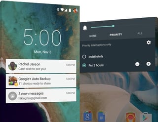 (3)(6)
Android 5 was a major direction change from three years of depth and 3D objects to extremely flat design. Lollipop was the first Android version to release with the announcement of “Google Material Design” at that year’s Google I/O conference. At this time, “card” design was Google’s newest direction in Material. Referring to the image above, notifications and menus have a very shallow design. The UI went very one dimensional and unnecessary details were removed. The biggest changes were the removal of reflective surfaces and shadows. The logo for Lollipop version is very telling of the system’s theme; flat and simple.
Android 6 - Marshmallow
 (3)(7)
Android 6 was released just one year later and built on the design of the previous version where Material matured more. Two of the most notable additions were complexity and shadows. The logo gets a little confusing with the shadows and the orientation of the “M” marshmallow, but hinted at the further development of layers and shadows in Android 7.
Android 7 - Nougat
 (3)(8)
Nougat is the most recent version of android and follows the August 2016 Material guide (Dec 2016 and April 2017 have been released after). Material is obsessed with physical space being represented digitally.
Material's 3D Space
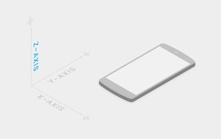 (9)
(9)
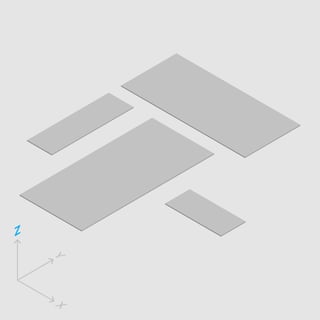
Though the screen is obviously not 3D, Material design uses the Z-Axis as a lairing system not as a perspective system. These layers even have thickness to them of 1dp and each UI element is on its own layer. Google’s Material Design guide described “1dp” as one pixel of thickness on screens with a pixel density of 160. Elements have a hierarchy on the Z-Axis where they exist and some elements like buttons, cards, and input fields are able to move on the axis. Moving on the Z-Axis requires the use of physics and shadows - not increasing or decreasing size on the X and Y-Axis.
 (9)
(9)
The X and Y-Axis can be any size needed as well as grow or shrink on screen, but the dp thickness will never change. To show emphasis on the subject, the material is raised on the Z-Axis and not necessarily expanded the X and Y-Axis.
Notes and Resources
I’m happy to be focusing these blogs more on design, and I feel that Google Material is a topic that deserves probably two more posts. Material’s hierarchy is laid out in the design guide where each layer rests and to which activated layers move to. This guide has me thinking about doing a small project where I build or mimic an app using physical material to explore the elevation layout. I think it would be a fun design exercise that I could try out within the next few weeks for another blog. In the sources below, I recommend that you go through all of them. The android version release pages are interesting to read through and see what features and designs were out at the time.
I have also been working on my project, “DataWall,” a lot over break and I invite you to read about it on my website. Thanks!
- Image from https://material.io/
- Image from https://www.uplabs.com/posts/android-logo-icons
- Logos by the Android team
- Image from https://developer.android.com/about/versions/android-4.0-highlights.html
- Image from https://www.imore.com/iphone-4s
- Image from https://www.android.com/versions/lollipop-5-0/
- Image from https://www.androidpit.com/android-m-release-date-news-features-name
- Image from http://www.androidauthority.com/samsung-galaxy-s8-plus-review-760314/
- Images from Google Material Design guide https://material.io/guidelines/


Comment